

This one is worth keeping as a topic, because it actually supports the T-shirts you sell. I would rewrite it so it sounds less like a generic clothing blog and more like Black Rune Works, while avoiding claims about printing methods or materials that may not apply to every product.
How to Identify a High-Quality Graphic T-Shirt Before You Buy
A graphic T-shirt can look impressive in a product photo and still disappoint when it arrives. Fabric can feel thinner than expected, seams can twist after washing, a print can look dull compared with the listing image, and a shirt that seemed perfect online can end up spending most of its life in the back of a drawer.
Quality is more complicated than simply choosing the heaviest shirt or the most expensive one.
A good graphic tee needs to work as a complete garment. The fabric should feel appropriate for how the shirt will be worn, the construction should hold its shape, the artwork should remain visually clear, and the fit should make someone want to wear it repeatedly.
That last part matters more than people sometimes realize.
A beautifully printed shirt is not especially useful if the wearer dislikes the fit. At the same time, a comfortable blank shirt becomes forgettable if the artwork is poorly positioned or loses its character once printed.
The best graphic tees bring both sides together.
For Black Rune Works, that means the shirt has to function as clothing first while still giving rune, knotwork, Mjölnir, Yggdrasil, and other Nordic-inspired artwork enough presence to make the garment distinctive.
Fabric Quality Is About More Than Thickness
One of the first things shoppers notice about a T-shirt is the fabric.
Heavier fabric is sometimes automatically described as better, but weight alone does not determine quality. A heavier shirt may feel substantial and durable, while a lighter shirt can feel softer and more comfortable in warm weather.
The better question is whether the fabric suits the purpose of the garment.
A casual everyday shirt should feel comfortable enough to wear for hours. Fabric that feels rough, stiff, excessively thin, or strangely plastic-like can make even excellent artwork difficult to enjoy.
The fabric should also recover reasonably well after being stretched.
If a neckline immediately becomes misshapen or the body of the shirt stays distorted after being pulled, that can be a sign that the garment may not maintain its shape well over time.
A quality shirt should feel like something designed to be worn repeatedly rather than simply photographed once for a product listing.
The Collar Often Reveals the Quality of the Shirt
The neckline is one of the easiest places to notice construction problems.
A collar sits close to the face, which means even minor distortion becomes visible quickly. A neckline that begins twisting, stretching, or developing waves can make an otherwise good shirt look worn long before the rest of the garment has reached the same point.
When examining a shirt, look at whether the collar lies evenly against the body.
It should not appear dramatically uneven from one side to the other. The seam where the collar joins the shirt should look consistent, and the neckline should return reasonably close to its original shape after being stretched.
Online shoppers cannot physically test those details before buying, so product photographs and descriptions become more important.
A well-presented listing should make the overall cut of the shirt clear rather than showing only an enlarged image of the artwork.
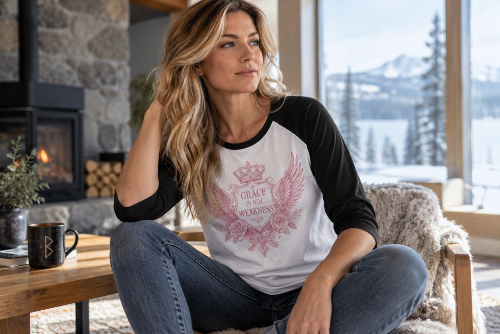
Seams Matter More Than Most People Notice
Seams are easy to ignore until something goes wrong.
A shirt can look completely normal when new and begin twisting after several washes because the fabric or construction pulls unevenly.
Side seams should generally fall where they are expected instead of spiraling toward the front or back of the garment. Sleeves should appear balanced, and the bottom hem should hang naturally rather than pulling noticeably in one direction.
Small differences are normal because fabric is flexible.
The issue is when the entire garment begins losing its shape.
Good construction should help the shirt remain recognizable as the same garment after repeated wear and washing.
That is particularly important for graphic shirts because large artwork makes distortion much more noticeable.
If the shirt twists, the artwork appears to twist with it.
A Good Graphic Should Be Designed for the Shirt
Artwork that looks great as a standalone image does not automatically become a good shirt design.
Garments move.
They fold across the waist, shoulders, and chest. Fabric stretches when someone sits, reaches, or walks. A printed image has to work within that movement.
Strong apparel design considers those realities.
A large back graphic needs enough breathing room around it so the artwork does not feel cramped against seams. A small front logo should look intentionally placed rather than appearing randomly dropped onto the shirt. Vertical designs need to remain visually balanced when the garment is worn rather than viewed completely flat.
This is especially important with detailed Norse-inspired artwork.
Knotwork needs enough width for individual strands to remain visible. Runes should stay recognizable. Metallic-looking textures should retain contrast. A detailed Mjölnir should still read as a hammer from a normal viewing distance.
A design that only looks good when someone zooms into a product image has not necessarily been optimized for clothing.
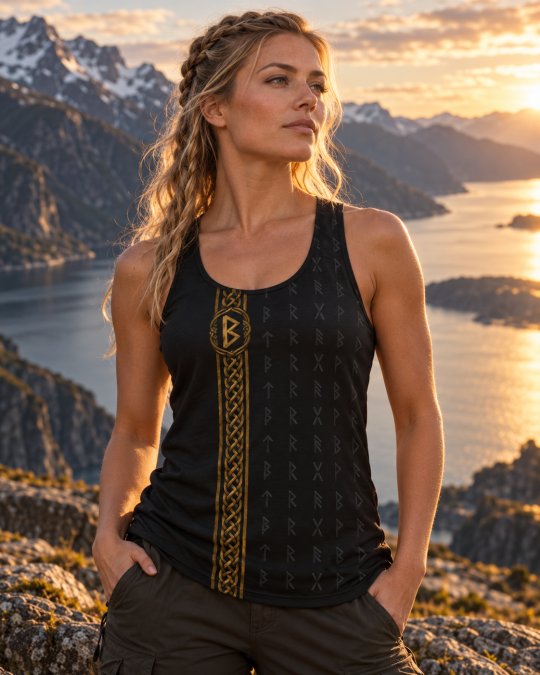
Readability Matters With Rune and Knotwork Designs
Intricate artwork creates a particular challenge.
More detail is not always better.
Extremely thin knotwork lines may look impressive at full resolution but disappear when printed at normal garment size. Tiny runes can merge into the surrounding artwork, and dark details against black fabric may become almost invisible unless the contrast was planned intentionally.
Good graphic design creates hierarchy.
The main symbol should be obvious first.
Supporting details reveal themselves afterward.
If Mjölnir is the focal point, the eye should find the hammer before getting lost in the surrounding knotwork. If a rune is the central element, it should not be buried under several other competing symbols.
This is one reason Black Rune Works has moved toward wider, more readable knotwork and stronger rune-focused compositions.
The artwork needs to work from across a room as well as up close.
Print Quality Is Not Just About Brightness
People sometimes judge print quality by how bright or heavy the ink appears.
That can be misleading.
Different production methods and fabrics create different finishes. Some designs are intended to look bold and saturated, while others intentionally use weathered, tonal, metallic, distressed, or faded effects.
A bronze Mjölnir should not necessarily look like a bright orange image.
A black-on-black rune field may be intentionally subtle.
A silver design against black may depend more on contrast and detail than extreme brightness.
The important question is whether the finished image matches the intended artwork.
Edges should remain reasonably clear. Fine details that are supposed to be visible should not disappear entirely. Colors should remain visually distinct where the design depends on separation.
A good print reproduces the character of the artwork rather than simply making every color as bright as possible.
Product Photos Should Show More Than One Angle
Shopping online removes the ability to physically inspect a shirt, so photographs have to do more of the work.
One image rarely tells the whole story.
A front view shows overall placement.
A back view reveals larger artwork if the design is carried there.
Angled or modeled images help demonstrate how the graphic behaves when the shirt is actually worn.
Close-up images can show smaller details.
This becomes particularly important when a brand uses different artwork on different parts of the garment.
Black Rune Works often keeps the front more restrained while allowing larger artwork to dominate the back. Seeing only one side would leave out a major part of the product.
The better the product photography, the easier it becomes for the shopper to understand what they are actually buying.
Fit Is Part of Quality
A shirt can be beautifully made and still be wrong for a particular person.
That does not necessarily mean the garment is low quality.
Fit is personal.
Some people prefer a closer fit. Others want additional room through the chest or waist. Sleeve length, shirt length, shoulder width, and body shape can all affect how comfortable a shirt feels.
This is why size charts matter.
Buying automatically based on the letter printed on the tag can be unreliable because sizing varies between garments and manufacturers.
Measurements provide a better reference.
Someone who already owns a shirt they like can lay it flat, measure it, and compare those measurements with the size information provided for the product they are considering.
That method is often more useful than assuming every large or extra-large shirt fits the same way.
A Shirt Should Still Look Good When It Is Moving
Product images usually show clothing under ideal conditions.
The garment is straight.
The lighting is controlled.
The model is positioned carefully.
Real life is different.
People sit down, drive, bend, reach, work, and move around.
A quality graphic should still look intentional when the fabric is not perfectly flat.
This is particularly important with large back artwork.
A design with a clear central structure tends to survive folds better than one composed entirely of tiny disconnected details.
Vertical patterns can also work particularly well because the natural movement of the body follows the general direction of the artwork.
A shirt should be designed for a person, not a flat rectangle.
Washing Habits Affect How Long a Graphic Tee Lasts
Even a well-made graphic shirt can wear prematurely if it is repeatedly exposed to harsh washing conditions.
Heat is particularly hard on many garments.
Turning a printed shirt inside out before washing can reduce direct friction against the artwork. Cooler water and a normal gentle washing routine are often easier on printed clothing than excessive heat or aggressive treatment.
Drying also matters.
High heat can be hard on fabric and printed artwork over time.
Always follow the care directions for the specific garment because materials and production methods vary.
The important point is that durability is shared between manufacturing and ownership.
A quality shirt provides a good starting point.
Care determines how much of that quality survives repeated use.
Quality Does Not Mean the Shirt Will Never Change
Clothing is a wearable object.
It will change.
Fabric softens.
Colors may slowly develop character.
The shape can relax slightly.
A favorite shirt worn every week will eventually look different from the day it arrived.
That is normal.
The difference between normal aging and poor quality is how quickly the garment becomes unusable.
A good graphic tee should remain something the owner wants to wear through many normal wash-and-wear cycles.
In fact, some shirts become more comfortable after they have been worn repeatedly.
The goal is not permanent perfection.
The goal is a garment that ages reasonably while retaining the parts that made the customer choose it in the first place.
Price Alone Does Not Prove Quality
An expensive shirt is not automatically a good shirt.
A cheap shirt is not automatically bad.
Price reflects many things beyond fabric, including artwork, printing, fulfillment, shipping, branding, marketing, manufacturing scale, and business expenses.
The more useful question is what the buyer receives for the price.
Does the garment appear comfortable?
Is the artwork original and carefully placed?
Are product photographs clear enough to understand what is being purchased?
Are sizing details available?
Does the design offer something that cannot simply be found on thousands of identical marketplace listings?
Those factors provide much more information than price alone.
Original Artwork Adds Value Beyond the Blank Shirt
Graphic clothing is unusual because the customer is buying two products at once.
They are buying the garment and the artwork.
A blank shirt may be perfectly functional, but a graphic shirt becomes desirable because someone wants the design specifically.
That means originality matters.
A carefully developed rune composition, custom Mjölnir, Nordic pattern, or knotwork layout gives the garment an identity beyond its fabric.
This is also why design consistency matters for a brand.
Customers begin recognizing a visual style.
Black Rune Works does not need every shirt to contain the same artwork, but the use of strong Nordic imagery, real runes, readable knotwork, dark foundations, metallic treatments, and intentional placement creates a connection between different products.
The shirt becomes part of a larger design language.
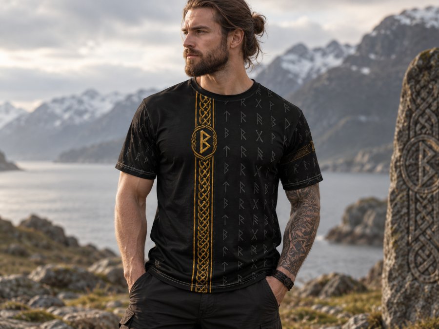
High Quality Means You Actually Want to Wear It
The most technical fabric specification means very little if the shirt stays in a drawer.
A genuinely successful graphic tee becomes part of someone's normal rotation.
The wearer reaches for it because it is comfortable.
The artwork still appeals to them after the novelty of buying something new disappears.
It works with the clothing they already own.
It survives normal use.
That is the standard that matters most.
A good graphic T-shirt should not merely look impressive on a store page.
It should continue earning its place in the closet after it arrives.
Frequently Asked Questions
How can I tell whether a graphic T-shirt is high quality online?
Look at the garment itself rather than focusing only on the artwork. Clear front and back photographs, sizing information, fabric details, care instructions, and modeled images can help you understand what you are purchasing before it arrives.
Is a heavier T-shirt always higher quality?
No. Fabric weight affects how a shirt feels, but heavier does not automatically mean better. Some people prefer substantial heavyweight fabric while others prefer a lighter, softer shirt. Construction, comfort, shape retention, and intended use matter too.
What makes a graphic print high quality?
A good print should reproduce the intended artwork clearly enough that important shapes, colors, and details remain recognizable. The correct appearance depends on the design because tonal, distressed, metallic-looking, and highly saturated artwork are intentionally different.
Why does knotwork need wider lines on clothing?
Very narrow details can become difficult to see once artwork is printed at garment size and begins moving with the fabric. Wider knotwork helps individual strands and crossings remain readable.
Should I wash graphic shirts inside out?
Turning a graphic shirt inside out can reduce direct friction against the printed surface during washing. Always follow the care instructions provided for the specific garment.
Do expensive graphic tees automatically last longer?
No. Price alone cannot guarantee durability or comfort. Fabric, construction, artwork quality, printing, care, and how frequently the garment is worn all contribute to its usable life.
How should I choose the correct size online?
Compare the product's size information with measurements from a shirt you already own and like. This is generally more reliable than assuming the same labeled size will fit identically across different garments.
What makes Norse graphic tees different from ordinary graphic shirts?
The garment may be similar, but the artwork draws from runes, knotwork, mythology, Nordic patterns, Mjölnir, Yggdrasil, or related visual traditions. Well-designed Norse apparel keeps those details readable while still treating the shirt as practical modern clothing.
Frequently Asked Questions
What fabric weight indicates a high-quality t-shirt?
Fabric weight is measured in GSM, or grams per square meter. A shirt in the 180 to 220 GSM range is a solid midweight that holds its shape and resists shrinkage. Anything under 150 GSM will likely feel thin and wear out quickly after repeated washing.
How does print method affect the longevity of a graphic tee?
Screen printing with plastisol ink bonds deeply into the fabric and survives dozens of wash cycles without fading. Direct-to-garment printing sits closer to the surface and can crack if the shirt is pulled or dried on high heat. Water-based inks feel softer but require careful curing to last. The print method matters as much as the fabric itself.
What are the signs of poor construction in a t-shirt?
Check the side seams first. A tubular shirt with no side seams will twist after washing. Look at the hem and sleeve stitching; single-needle stitching unravels faster than double-needle. If the neckline has no tape covering the seam, it will stretch out. Loose threads at stress points signal weak construction that will not last.