

From Rune to Wardrobe: How Norse Symbols Become Modern Apparel
Norse-inspired apparel works best when the symbol, garment, and person wearing it all belong together. A rune should not be added simply because there is empty space on a shirt, and knotwork should not be used only because it immediately looks Nordic. Strong design begins with meaning and then finds a modern way to carry that meaning into everyday life.
That distinction is important for Black Rune Works. The goal is not to reproduce historical Viking clothing or create garments that feel like costumes. The goal is to take recognizable Norse visual language, including runes, knotwork, Mjölnir, Yggdrasil, and related imagery, and build it into clothing people can actually wear now.
A modern shirt can carry an ancient-looking symbol without pretending to be ancient. A hoodie can feature detailed knotwork and still work with jeans. Leggings can carry rune-inspired artwork and still function as athletic apparel. The garment belongs to the present even when its visual inspiration reaches much further back.
That is where the design process becomes interesting. Meaning has to survive the transition from symbol to artwork and from artwork to clothing.
Meaning Comes Before Decoration
A strong Norse-inspired design should begin with a reason for existing.
Runes are visually striking because their forms are simple and angular, but their appearance alone should not determine how they are used. When a real rune is chosen, its historical context and later interpretations should be understood rather than replacing it with an invented symbol simply because the invented version looks more dramatic.
That matters particularly for Black Rune Works because the brand works with actual runes as well as modern designs built around them. A symbol may represent an idea such as protection, growth, inheritance, communication, or strength depending on the rune and the interpretation being used. Modern meanings should not be confused automatically with meanings that can be proven historically, but that does not prevent someone from developing a personal relationship with a rune today.
A garment becomes more interesting when the wearer knows why a symbol is there.
Without that connection, the rune becomes decoration. With it, the garment can serve as a reminder of something the wearer values.
The same principle applies beyond runes. Yggdrasil imagery can suggest connection, growth, and the relationship between different parts of life. Mjölnir can carry associations with strength and protection. Knotwork can visually communicate continuity because one line appears to move through the entire design.
The artwork becomes stronger when its form supports its idea.
Real Runes Create a Stronger Foundation
There is no shortage of modern graphics that look vaguely runic without belonging to any historical runic alphabet.
That may work for fantasy artwork, but it is a different approach from deliberately using real runes.
When Black Rune Works builds a rune-focused design, using recognizable runic forms gives the artwork a foundation. The design can still be modern, metallic, colorful, or highly stylized, but the underlying symbol does not have to be invented.
That also creates an opportunity for the wearer to learn what they are carrying.
Someone may first choose a garment because the artwork catches their attention and only later become curious about the rune itself. That curiosity can lead to a deeper understanding of Elder Futhark, Norse symbolism, and the difference between historical evidence and modern interpretation.
The clothing becomes a starting point rather than the end of the story.
That is far more interesting than covering a garment with random angular marks and calling them runes.
The Symbol Has to Survive the Design
Once a meaningful symbol has been chosen, the next challenge is making it visually interesting without destroying what made it recognizable.
This is especially important with runes.
A rune can be surrounded by knotwork, metallic textures, geometric framing, or other Nordic elements, but the central form should remain readable. If decoration changes the rune so dramatically that the original symbol disappears, the design has lost part of its foundation.
Negative space helps prevent that.
Giving the central rune breathing room allows the eye to recognize it before exploring the details surrounding it. Wide knotwork can create complexity without becoming visual noise. Metallic accents can create depth without changing the basic shape.
The most effective designs usually have a hierarchy. The eye sees one important element first, then discovers the secondary details.
That is what keeps intricate artwork from becoming cluttered.
Why Wide Knotwork Works Better on Clothing
Knotwork that looks impressive on a large computer screen can become almost unreadable when printed across a sleeve or placed on the side of a shirt.
Clothing changes scale.
Fabric bends, stretches, folds, and moves. The artwork may be viewed from several feet away rather than examined from inches away. Fine lines can disappear visually, while extremely tight crossings can blend together.
Wider knotwork solves many of those problems.
The path of the design remains easier to follow. The crossings stay visible. The artwork survives movement better, and the overall pattern continues to read as knotwork instead of becoming an indistinct texture.
This also makes the design more versatile.
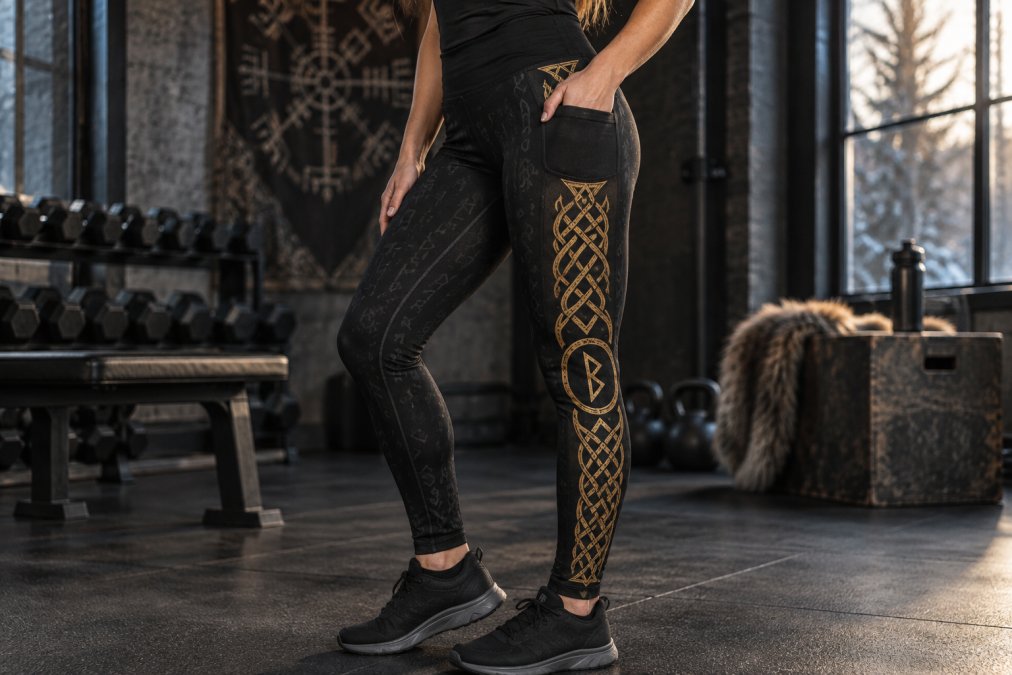
Wide knotwork can run vertically down a shirt, follow the sleeve of a hoodie, frame a rune, or travel along the leg of leggings. Because the individual strands remain visible, the same visual language can move across different products without needing to become excessively complicated.
That is particularly useful for a brand like Black Rune Works, where one design idea may need to work across several types of apparel.
The Garment Changes the Artwork
A design should not simply be created once and pasted onto every product.
A T-shirt, hoodie, pair of leggings, shorts, and joggers all have different proportions. They move differently and provide different areas for artwork.
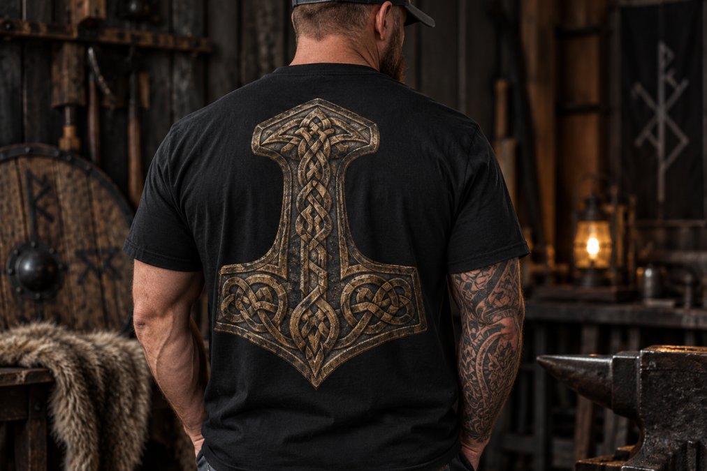
A shirt gives the designer broad front and back surfaces. That makes it suitable for a central rune, a vertical knotwork feature, or a larger back composition.
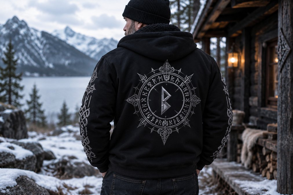
A hoodie adds sleeves and a hood, which creates additional opportunities. A restrained front can be paired with a larger back design while rune or knotwork details travel down the sleeves. The result can look different depending on the viewing angle without becoming overloaded.
Leggings present another challenge because the legs are narrow, long, and constantly moving. Artwork needs to follow that shape rather than fight it. When pockets are involved, the design has to respect the construction instead of pretending the pocket does not exist.
The garment is not simply a canvas.
It is part of the design.
Why Placement Matters So Much
Graphic placement can completely change the personality of the same artwork.
A large symbol centered on the chest creates an immediate statement. Moving the primary artwork to the back allows the front to remain quieter. A smaller left-chest mark feels more like branding than illustration. Sleeve artwork creates detail that reveals itself as the wearer moves.
None of these approaches is automatically correct.
The placement should support the purpose of the garment.
For everyday Black Rune Works pieces, a cleaner front can make a detailed hoodie easier to wear in more situations. The back can carry the larger visual story while the front remains controlled. Sleeves can add rune or knotwork detail without forcing every design element into the center of the garment.
This balance also makes layering easier.
A small chest mark can remain visible when a jacket is worn open, while a large back design becomes the focal point once the outer layer comes off.
Thoughtful placement creates versatility.
Metallic Color Changes the Character of a Design
The same rune can feel completely different depending on how it is presented.
Gold against black creates warmth and strong contrast. It can make knotwork feel more ornamental and give a central rune more visual weight.
Silver and chrome produce a colder, sharper appearance. They naturally complement black and charcoal garments and can give a rune-focused design a more restrained industrial feel.
Bronze sits somewhere between those directions. It can suggest age and material texture without requiring the garment itself to imitate historical clothing.
Color can also move beyond metallic tones.
The Aurora designs demonstrate how teal and cyan accents can take rune and knotwork imagery in a more contemporary direction. The Nordic foundation remains, but the color changes the emotional character of the garment.
The important thing is consistency.
Color should reinforce the artwork rather than distract from it.
Norse-Inspired Clothing Does Not Need to Become Costume Wear
One of the biggest advantages of modern apparel is that historical inspiration does not require historical clothing.
Someone can appreciate runes, mythology, knotwork, or Norse values without wanting to wear a tunic and cloak.
A black graphic shirt can carry the symbolism just as easily into a modern wardrobe. A sherpa-lined hoodie can provide real cold-weather usefulness while carrying Yggdrasil or rune artwork. Athletic apparel can use Nordic patterns while remaining designed for movement and everyday activity.
The visual influence is what creates the connection.
That distinction allows Norse-inspired apparel to become part of ordinary life.
You can wear it while working, traveling, training, going out, spending time outdoors, or simply going through a normal day.
The symbolism does not need a special event to become relevant.
Symbolism Works Better When the Clothing Gets Worn
There is a practical reason wearable symbolism can become powerful.
Repetition creates familiarity.
A symbol that is seen every week becomes connected to experiences. The hoodie worn during a difficult winter eventually carries memories of that period. The shirt worn while working toward a goal becomes associated with the effort. A rune selected because of a particular value can become connected to moments when that value was actually needed.
The garment starts with a design.
The wearer adds the history.
That is one reason clothing chosen intentionally can feel different from novelty merchandise. Its meaning is not limited to whatever the artist intended when the graphic was created.
The wearer continues the story.
A Strong Design Does Not Need Every Norse Symbol at Once
More symbolism does not automatically create more meaning.
A garment containing runes, ravens, Mjölnir, Yggdrasil, wolves, knotwork, ships, and every other recognizable Nordic motif at the same time can quickly lose focus.
The strongest artwork often makes one idea dominant.
A Mjölnir design should be allowed to feel like a Mjölnir design. Yggdrasil should have enough space to remain visually recognizable. A rune should not have to compete with six other symbols for attention.
Supporting details can still be used, but they should strengthen the central idea.
This is another place where negative space becomes valuable. Empty areas are not wasted space. They give the important elements room to become important.
Restraint can make a design feel stronger rather than simpler.
Designing for More Than One Product
One of the most useful qualities in a Black Rune Works design is adaptability.
A strong central rune may work on a shirt, hoodie, shorts, or accessory. Knotwork can be adjusted to follow sleeves or pant legs. A metallic version can be created for darker garments while another variation can introduce brighter color.
The design should remain recognizable even when the layout changes.
That requires identifying what is essential.
If the central rune is the identity of the artwork, it should remain intact when the design moves to another garment. Knotwork can expand or contract around it. Borders may change. Placement can shift.
The core idea stays recognizable.
That creates a collection rather than a group of unrelated products.
The Front and Back Can Tell Different Parts of the Same Story
A garment does not need to display everything at once.
The front can introduce the brand quietly. The back can carry the full illustration. The sleeves can extend the visual language using runes or knotwork.
When those areas are designed together, the wearer gets something that reveals different details depending on how it is viewed.
That is more interesting than repeating the exact same graphic everywhere.
It also allows the garment to remain wearable.
Someone facing the wearer may see a simple Black Rune Works chest mark, while someone behind them sees the full rune or knotwork design. As the wearer moves, the sleeve artwork connects the two views.
The garment becomes a complete object rather than a blank shirt with a picture placed on it.
Meaning and Wearability Have to Work Together
There is no benefit in creating meaningful artwork on a garment someone does not enjoy wearing.
Comfort, fit, warmth, movement, and practicality remain part of good apparel design.
That is why different Black Rune Works products serve different roles. A lightweight shirt works differently from a sherpa-lined hoodie. Athletic leggings solve different problems than joggers. A detailed Nordic pattern garment serves a different visual purpose from a simple logo piece.
The design has to respect those differences.
Meaning may be what draws someone to the product, but wearability is what keeps the product in regular rotation.
The strongest apparel provides both.
From Artwork to Something Personal
A designer can choose the rune, build the knotwork, create the color palette, and decide where everything belongs.
After that, the garment leaves the designer's hands.
The person wearing it decides what it eventually means to them.
That may be why Norse symbolism continues to work so naturally on modern apparel. The imagery already carries a long history of interpretation, but it still leaves room for personal meaning.
A rune can become connected to someone's own experience. A Yggdrasil design can remind one person of family and another of growth. A Mjölnir graphic can represent strength to one wearer and perseverance to another.
Clothing gives those ideas somewhere to live.
That is the point where a graphic stops being only artwork.
It becomes something carried.
Why Black Rune Works Builds Around This Idea
Black Rune Works is not about dressing people as Vikings.
It is about bringing strong Norse-inspired visual language into clothing people can wear today.
That means using real runes when a design calls for runes, keeping knotwork readable, choosing placement intentionally, letting garments retain their practical purpose, and avoiding unnecessary complexity simply for the sake of looking more elaborate.
Some pieces are restrained. Others are deliberately bold. Some use metallic gold or silver. Others move into brighter colors. Shirts, hoodies, leggings, joggers, and other garments provide different ways to carry the same broader design philosophy.
The common thread is intention.
The symbol should mean something.
The artwork should respect the symbol.
The garment should respect the artwork.
And the finished piece should still be something someone genuinely wants to wear.
That is how a rune moves from an old visual language into a modern wardrobe.
Frequently Asked Questions
Are all rune-looking symbols historically real runes?
No. Modern Nordic and fantasy artwork often uses invented symbols that resemble runes. Black Rune Works can use genuine runic forms when a design is intended to be rune-focused while still creating modern artwork around them.
Can real runes be incorporated into modern designs?
Yes. A historical rune form can remain recognizable while being surrounded by knotwork, metallic effects, geometric framing, or other contemporary design elements.
Why does knotwork need to be wider on apparel?
Clothing moves, folds, and is usually viewed from farther away than digital artwork. Wider knotwork keeps the individual paths and crossings visible after the design is printed on a garment.
Does Norse-inspired apparel have to look historically accurate?
No. Modern apparel can draw on Norse symbols and visual traditions without attempting to reproduce Viking Age clothing. A modern shirt, hoodie, or pair of leggings can carry historically inspired imagery while remaining completely contemporary.
Why put large artwork on the back of a hoodie?
A large back area gives detailed artwork more space while allowing the front to remain cleaner and easier to wear. Sleeve designs and a smaller front logo can then support the main artwork without crowding it.
Can the same rune design work on several different products?
Yes, but the layout may need to change. The central symbol can remain consistent while knotwork, framing, scale, and placement are adjusted to suit shirts, hoodies, leggings, shorts, or other garments.
Does a rune have to have the same personal meaning for everyone?
No. Historical context and modern interpretations provide a foundation, but people can also develop personal associations with a symbol based on their own experiences and values.